Appearance
Creating Dashboards in Asemic
Dashboards in Asemic allow you to combine multiple visualizations into a single view, providing a comprehensive overview of your key metrics and insights. This guide will walk you through the process of creating and customizing dashboards.
Creating a New Dashboard
Creating a Dashboard from scratch
One the homepage of your workspace go to Dashboards, if not already there. Here's a dashboard-like option named KPI EXPLORER, this is where you can go for a quick look of a specific metric(s), but also a place where you can start building a dashboard.
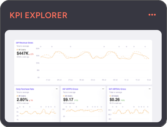
- In the top right corner of KPI EXPLORER click on a the options and then
Clear Dashboard - Click the KPI EXPLORER
- Add Visualizations and set up Segments
- Click on the top right button
Save as Dashboard - Give it a name

Now the dashboard is saved as private. You can find it on the home screen in Dashboard -> All Dashboards, or in Dashboards -> My Dashboards.
Editing a Dashboard
In the top bar there's Edit Mode switch. As long as it is on, there's an indicator next to the name of a dashboard signaling that Auto-save is on. Every change will be saved and synced with the cloud.


If you, as a creator, turn off Edit Mode, you can interact with the dashboard as anyone else, no changes will be made.
Sharing a Dashboard
Once you create a Dashboard, there will be a new option on the right side of top bar - Share with closed lock icon. Click on it and you will have two options:
- Publish - makes it discoverable to everyone in the workspace, it will appear in their All Dashboards space
- Copy Link - keeps the dashboard private, but anyone who you share the link with can access the dashboard
Clicking on the Share you can make previously public dashboard private again.
Creating a Dashboard from another dashboard
Open a dashboard of interest. Click the arrow next to the name of the dashboard in the top bar and then click Clone. Now you can make changes without affecting the original dashboard.
Adding Visualizations

There are 3 options currently available:
- Add Chart For Daily Metrics
- Add Cohort Chart For cohort metrics
- Table For deep dive and detailed analysis
- Funnel [WIP] For making basic funnels
1. Add Chart
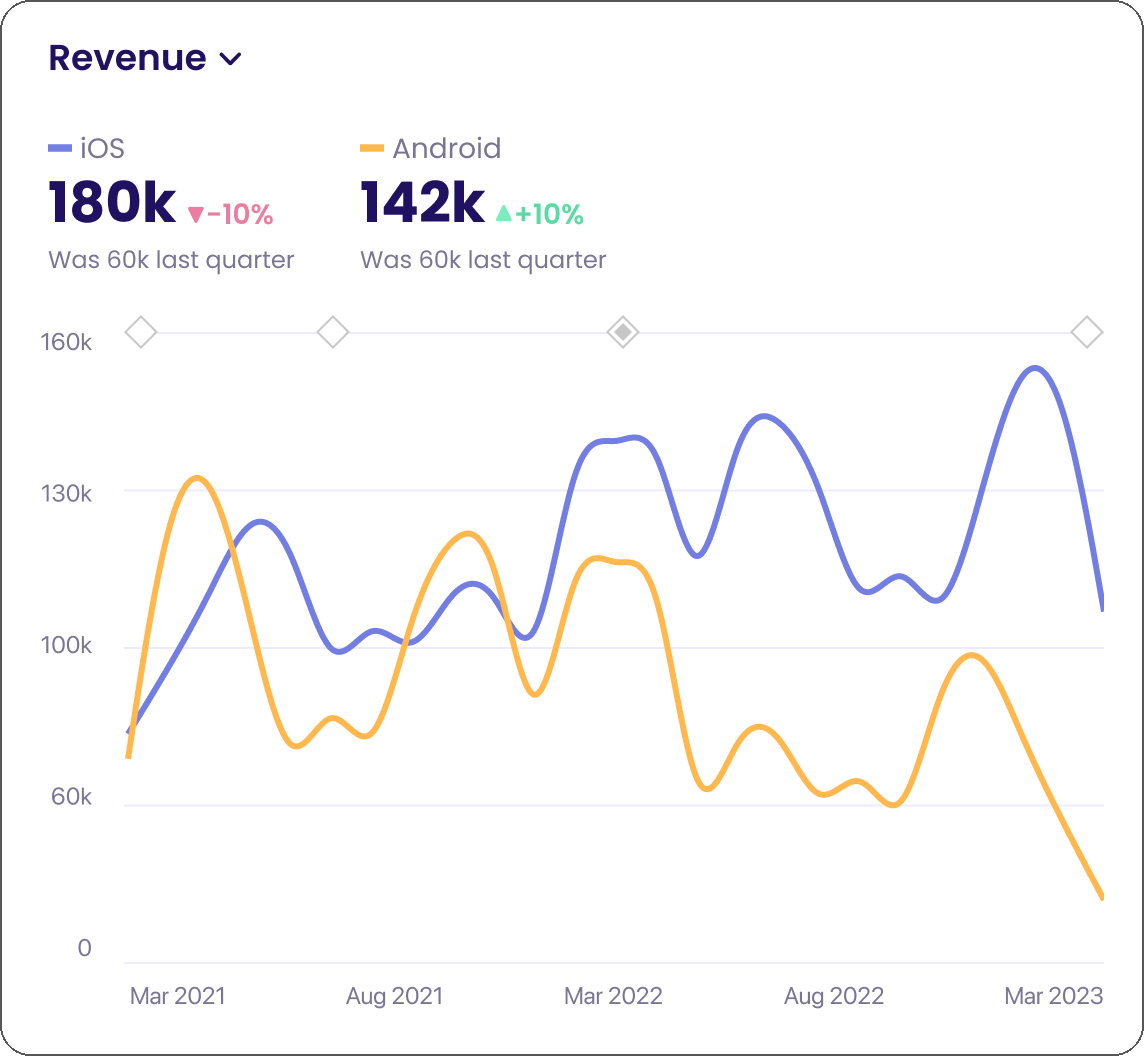
Click the Add Chart on the top bar (first option). You can select multiple metrics to add, each will be added as a separate chart.
Default view is Line chart, but you can change it in Full Edit Mode.

2. Add Cohort Chart
Click Add Cohort Chart on the top bar. You can select multiple metrics to add, each will be added as a separate chart.

2. Add Table
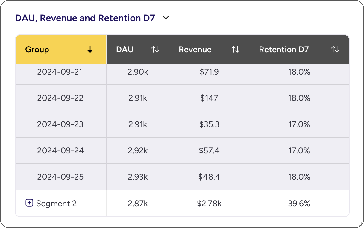
Click Add Table on the top bar. You can select multiple metrics to add, they will all be added to the table.
3. Add Funnel
Click Add Funnel on the top bar. A funnel chart will be added to the dashboard and immediately open in edit mode where you can define it.
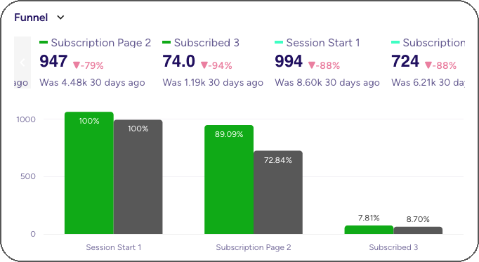
In the image: Subscription Funnel for Android (green) and iOS (dark gray) users, shown in absolute numbers.
Funnels work with Segments, you can use the same funnel definition and easily compare the results between segments. Other options include:
- displaying absolute or scaled % numbers
- counting occurences or users
- tracking conversion from step to step or through time
Adding Text
- Click the "Add Text" button to add explanatory text to your dashboard.
- Use the rich text editor to format your text and add links.
Arranging Your Dashboard
- Drag and drop visualizations to rearrange them on your dashboard.
- Resize visualizations by clicking and dragging the bottom-right corner.
Applying Global Filters - User Segments
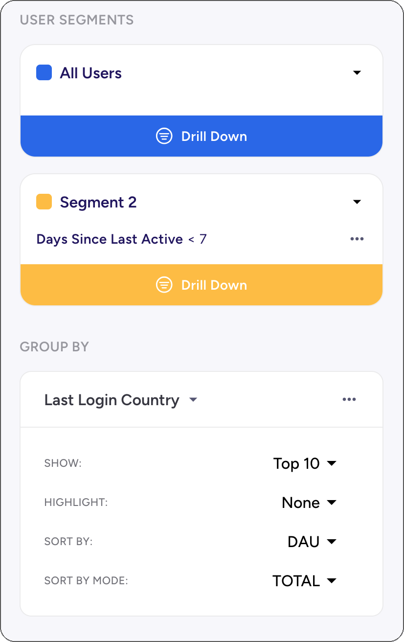
1. Drill Down
Click Drill Down on any existing segment to add a filter to the segment. This will be applied to all the charts that are using global segments.
Note: Charts that are not using global settings will have broken link icon displayed in the corner.
2. Add Segment
Click +Add Segment to add another segment. By default it will contain All Users.
3. Add Group By
Click +Add Group by and pick a dimension from the list.
By default Top 10 groups will be selected and for each chart its primary metric will be used. You can also set the global sorting criteria using another metric.
For example, Top 10 countries by Retention d1 will often be places where there are just a few active users (pushing Retention to near 100% easily). Instead we might want to take a look at the retention of users in top N markets, which is easily done by setting Sort By to Revenue. This way all the charts will show the same 10 countries, which makes it easy to check various metrics at once.
Dashboards: Asemic Way
Asemic is not a dashboarding tool. Dashboards are just a format for communicating data, but in Asemic the first class citizens are metrics and other elements defined in Semantic Layer. Dashboard is a container within which we can easily recombine these building blocks for various purposes.
Ad-hoc data requests: Business often needs value of a metric for a specific segment. Just go to KPI explorer, pick a metric or more and define your segment(s). You don't have to save this, it's a minute of work to get it and it is always available.
Exploratory Analysis: Asemic allows building highly complex analysis out of the box and supports large number of Charts. Put 100s of charts with various segments to give yourself multiple perspectives on data. Once you satisfy your curiosity, build a proper dashboard for sharing with other people.
Operational Dashboard: There are business units that require a fixed set of metrics with the ability to change the view by tinkering with available filters. In Asemic the line between creating a dashboard and interacting with one is blurred. This enables much greater flexibilty in interacting with a dashboard.
Remember, the most effective dashboards are those that provide clear, actionable insights at a glance. Take the time to refine your dashboards and ensure they're meeting the needs of your team.